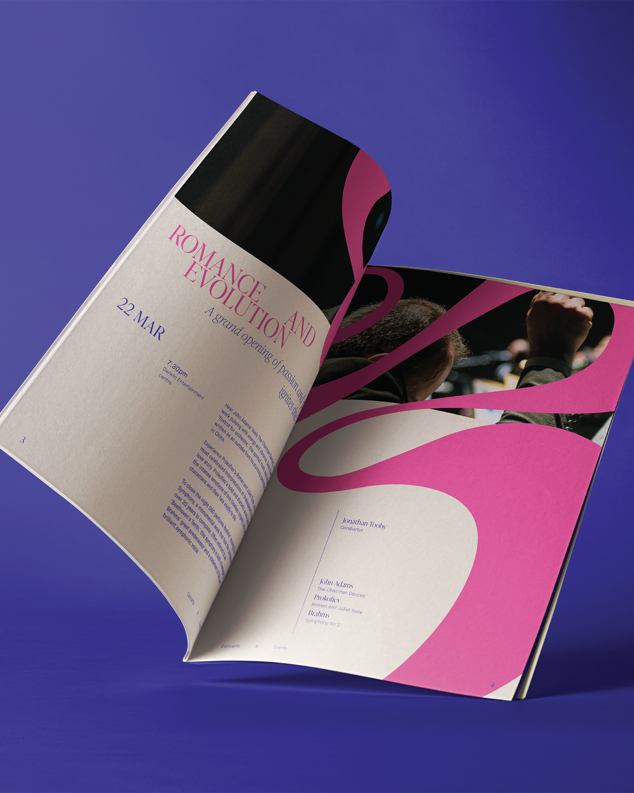
The rebrand draws inspiration from the conductor’s hand movements during performances, which unify the musicians, maintain tempo, and convey emotion. These are translated into the logo’s fluid strokes, shapes, and line movements with subtle references to the initials of the Darwin Symphony Orchestra. Typography combines both serif and sans-serif typefaces symbolising the interconnection between the traditions of classical music and contemporary design elements. The program’s design layout reflects principles of Swiss design, using negative space, alignment, and typographic hierarchy to establish clarity and structure. The animated poster extends the brand identity by transforming the logo into a pixelated, digitised form that deconstructs into rectangular shapes before reforming into the fluid logo mark.
Darwin Symphony Orchestra


