Adelaide Central Market
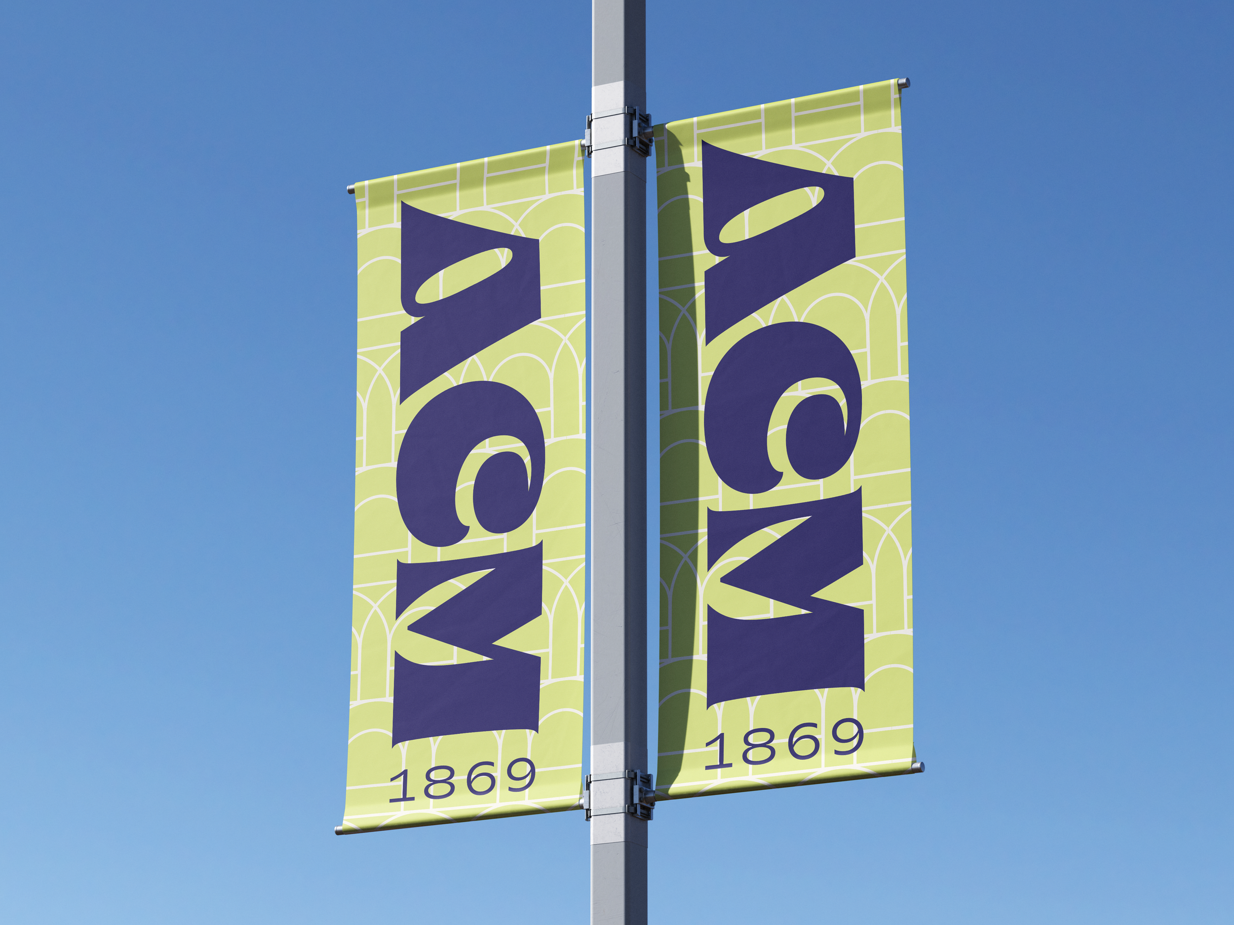
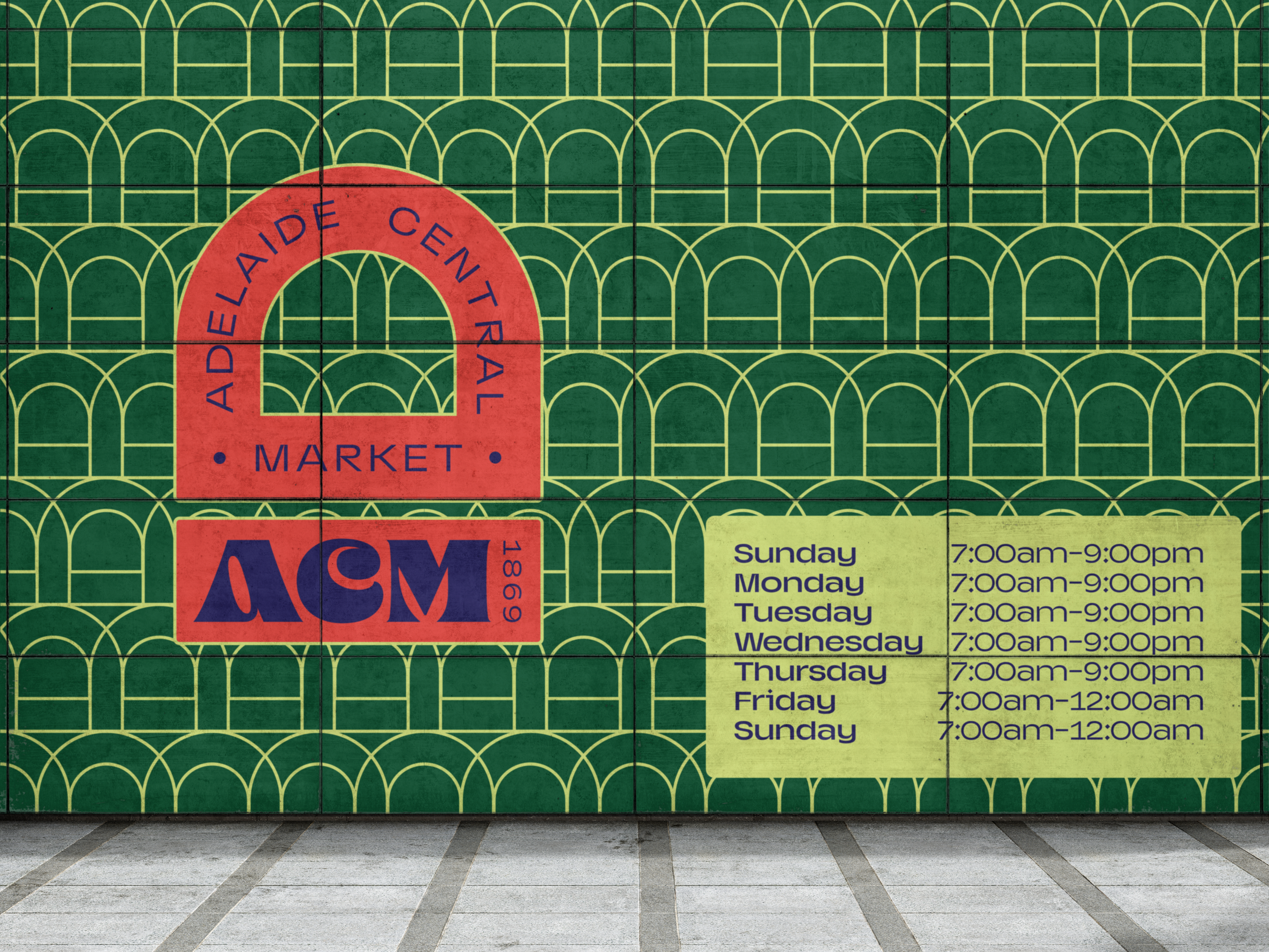
The Adelaide Central Market (ACM) rebrand and wayfinding is a contemporary take on the ACM’s rich history and culture. The brand identity references the architecture’s heritage through the rounded windows, while remaining new and refreshing for its younger demographic. The wayfinding system was heavily inspired by East Asian night markets, utilising vivid LED signages which strongly attract a younger demographic while making the typography legible. The ACM booklet effectively showcases this as it aims to encourage visitors to thoroughly explore with the map included. The colour palette is used effectively to visualise each section of the markets. The brand pattern is consistently used throughout the environmental graphics, signage, and merchandise to establish strong brand recognition.
Reimagining the Adelaide Central Market’s branding,
wayfinding system and merchandise.


